
| Year 2019 Client |
Categories UX/UI Design Visual Design Responsive Web Design Art Direction |
Team Shore/Nicci Yin (UX, Visual, Development) Brooks Running (UX and Copy) Velvet Design (Illustration) |
- Design an experience that helps women find and decide on a bra to purchase based on meaningful criteria.
- Amplify the Brooks brand throughout the experience, while ensuring we're talking with the consumer.
- Establish Brooks as an industry expert by educating the consumer on "Run Bras."
- Decrease barriers to purchase.
↑ Video: Desktop click-through of some screens in the Run Bra Finder.

In addition to the overall sequence of questions in the Finder, there are a couple of examples that were designed for specific goals:
- We designed Sizing Help Modals to talk with and educate consumers on how to measure your size, sizes that might be missing and why, and alternative sizes to use.

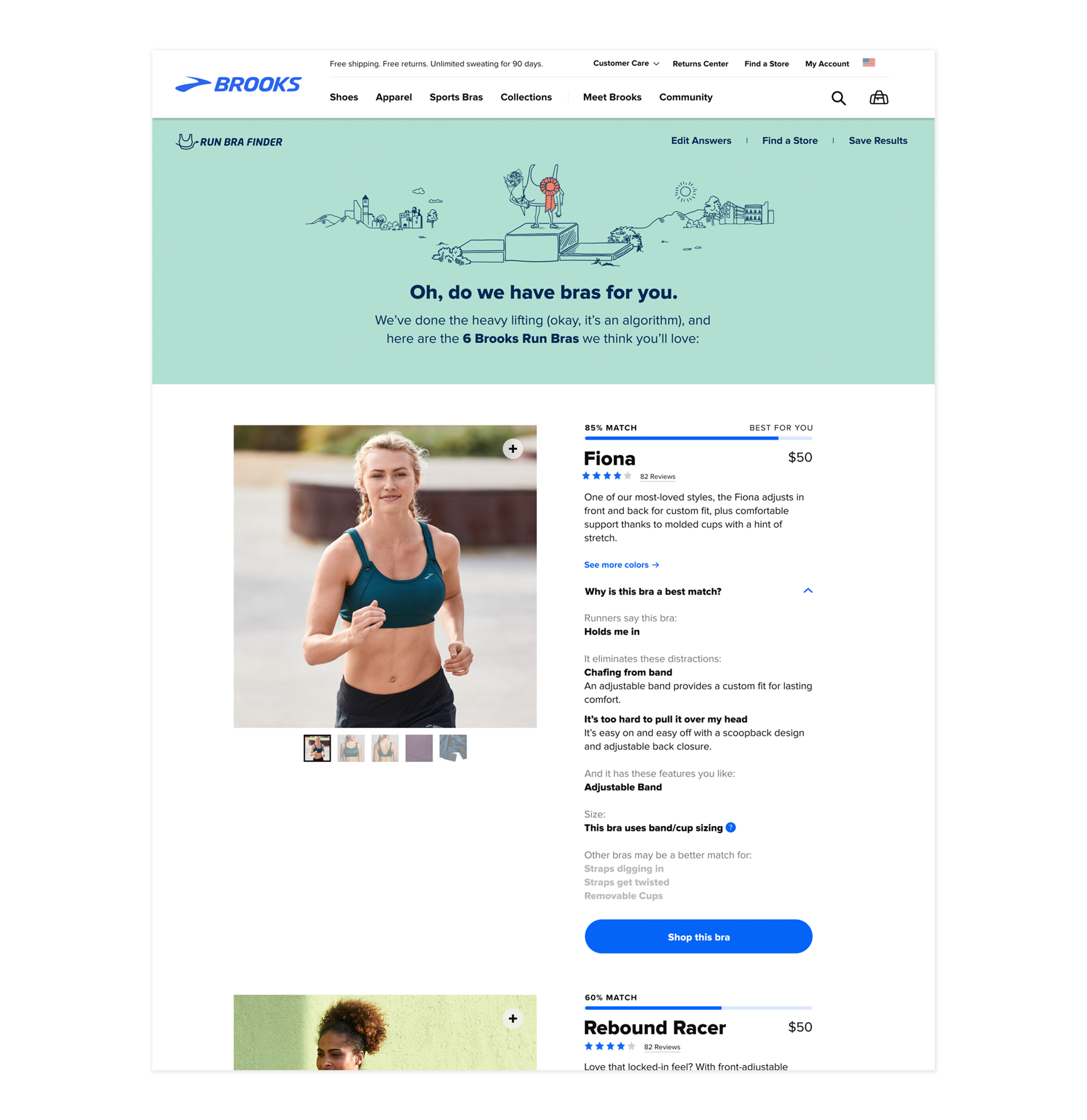
- The Finder Results Page helps seamlessly translate product discovery to purchase. It uses content from Brooks' PDPs, using key information (Product Name, Price, Reviews, and More Colors) as well as a prominent call-to-action that leads them to shop the bra.
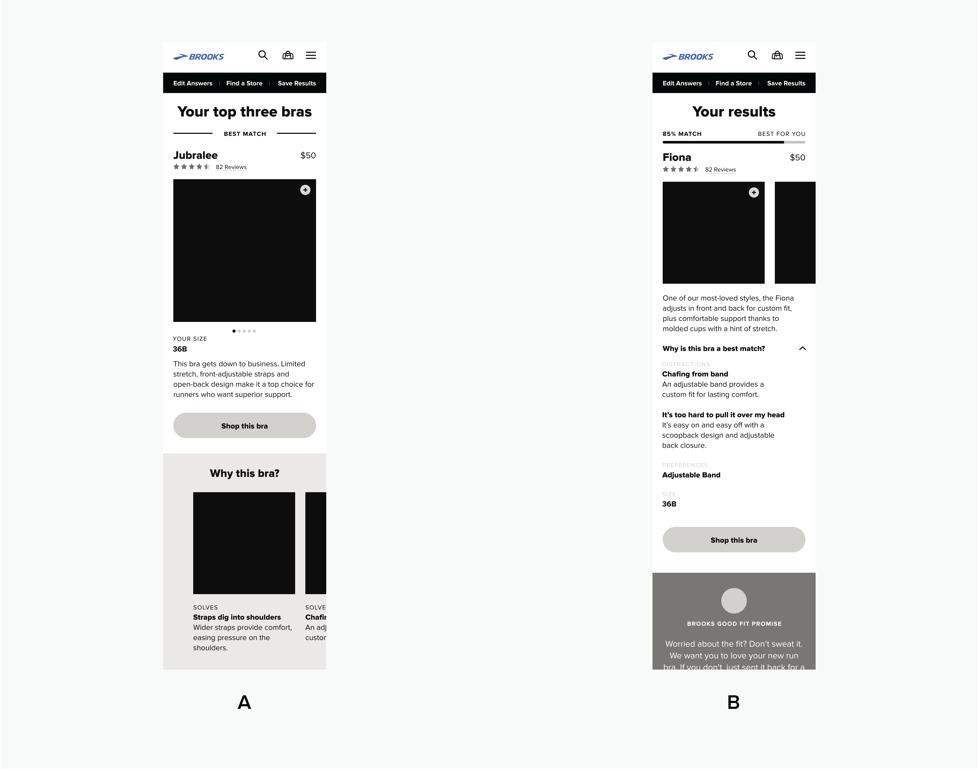
In the wireframing stage, we tested two mobile prototypes with women in their 20s to 40s who run at least 10 miles per week. The user tests focused on the following:
- Prototype flow and sequence of questions
- Ways to answer questions (inputs and interactions)
- User understanding of sections: Experience, Size, Distractions, Preferences
- Perception of Results Page

↑ Wireframes for prototypes A and B.
Prototype A was "choose your own adventure," where users would be met with a chapter page after every section to determine which section they wanted to go to next. There is no predetermined flow in order to create an open, investigatory experience that would be distinct from other existing finders.
Prototype B was a guided, linear flow. Instead of a subnav tracking answers at each stage, we used a progress bar which users actually preferred. We found that this sequence offered less confusion, although many commented that Size should be asked first.
We used this opportunity to test various input layouts and interactions:

↑ Distractions: Prototype A's interaction proved to be more engaging and intuitive, as the zooming and hotspot interactions allowed users to relate their own bodies to areas on the model.

↑ Preferences: Some users commented that Prototype B led them to learn about features they previously hadn't known about, and was more clear because of the sequential screens.
↑ Results: Users preferred Prototype B with percentages, since they understood they were not going to have all their distractions and preferences addressed. The explanations also helped them decide if they would choose a bra with a lower % match if it addressed a need that was more important.
Ultimately version B was the winning user flow, although 'Distractions' and 'Results' were more preferable from test A. The final prototype combines elements from both testing versions.
There were multiple visual directions for the Run Bra Finder, including an initial version using shades of blue found on the Brooks site. To reflect a more colorful brand voice and be a distinct experience from the Shoe Finder, I incorporated blobby shapes, textures, and color combinations into the chapter dividers.
To avoid using stereotypically gendered color schemes, I used colors—desaturated and lightened—from the Brooks palette to create a softer look and feel. A user remarked that the design "didn't make [her] feel too girly, and made [her] feel like it cared."

From the beginning, we wanted to incorporate playful illustrations on photos that are distinctive of the Brooks brand. To set a different tone from PDP photography, we opted for softer, warmer lighting in a studio setting, yet still showing the bras on real bodies and in action. It was also important to includes a range of body types.

↑ Sketches and color for art direction.
In collaboration with an illustrator, I created animations for the chapter divider screens and results page, as well as illustrated elements throughout the UI and content. We came up with the concept of a literal running bra and imagined various scenarios this bra might appear throughout the journey/run of the Finder experience.

↑ The running bra as a page loader ☺
The design phase of this project took place over the course of four months, and was a collaboration between Shore and Brooks Running's internal UX and copywriting teams. The Finder can be experienced here.